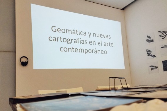
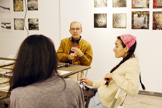
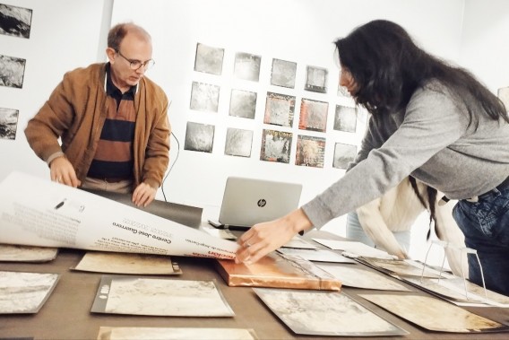
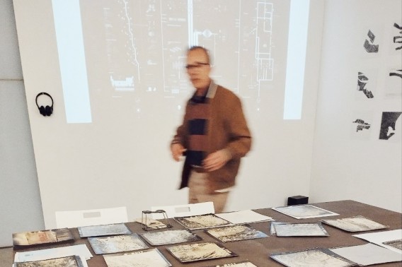
In the framework of Jeannette Unite’s exhibition “Geomatics: Land | Law | Minerals”, we held a round table on December 4, 2024: “Geomatics and new cartographies in contemporary art”, with the participation of the exhibition curators Guillem Cervera and Sara María Rodríguez (Matilde Igual excused her absence), and we also had the participation of Lamia Mohacht and Lucía Firbas.
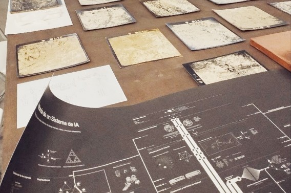
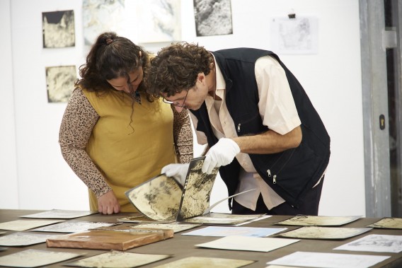
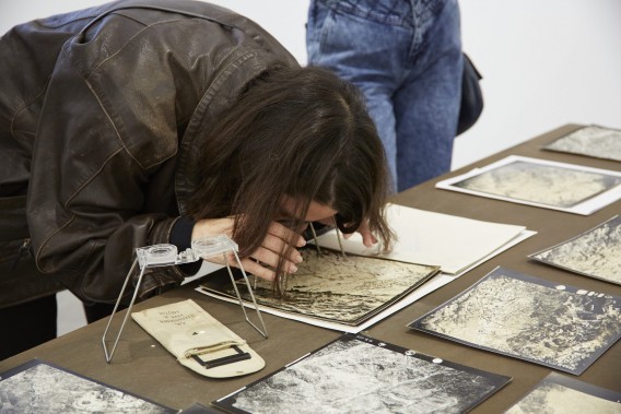
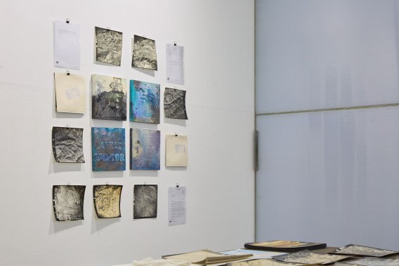
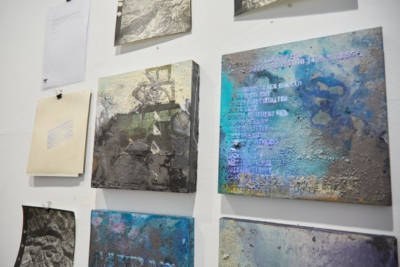
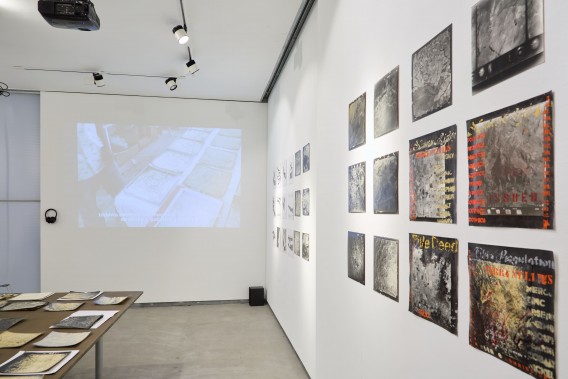
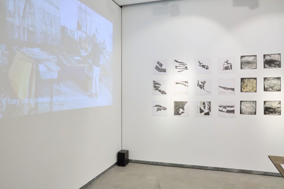
As told in another article about this exhibition, it was incorporated into the programming of La Posta Foundation by obtaining an honorable mention in the 2023 for 2024 call for “Art and Geology”. This is an exhibition project that includes a set of plastic works made under the inspiration or, directly, on aerial photographs (or sometimes using as raw material the photographic negatives themselves, all of them a 30×30 cm material), which were taken by the Spanish army in 1956 in South Africa, where mining activity, mineral deposits and parceling produced by human activity can be seen, and on the left margin, detailed information on the conditions under which these photographs were taken, photographs that, after various vicissitudes, after being declassified and sent to the University of Oxford, were finally sent from there to the Nelson Mandela University of Cape Town (South Africa), to end up, in the second decade of the 21st century, being found by Jeannette Unite, who has transformed them into an artistic project that, since then, has not stopped evolving and developing.
In this context, we had to talk about geomatics, following a bit in the wake of the round table held by the Jeannette Unite group in Cap Town (see here), emphasizing the importance that cartographies and mapping work are gaining in the field of contemporary art, in the context of what has been called the “geographic turn” [Anna Maria Guasch, 2016, 161-204].
Almost no one remembers it anymore, but there was a time when geographers made geographical charts, however, today it is an activity that has separated from the common core of geography, has become extremely specialized and has become technical to the point of reaching big data and its management through the use of computer applications made specifically for this purpose, at which time, paradoxically, from the field of visual arts, it has been recalled that a map is an image, which can be plastic or mental (conceptual), but which in any case enters fully into the field of art.
We discussed these issues at the round table, starting by recalling the background of this cartographic activity in the field of visual arts during the 20th century, up to the latest achievements in the 21st century.
Going back to the beginning of the 20th century, we cannot fail to mention the Surrealist Map of the World, published in the Belgian magazine Variétés, in 1929. In it we can see that some Pacific islands appear oversized. Surely due to the influence on the minds of the artists of the time of the periods when Paul Gaugin was in Tahiti and the Marquesas Islands, in French Polynesia, and the artistic production carried out there, which has left such a deep mark on the history of art.
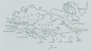
Surrealist Map of the World, published in the Belgian magazine Variétés, in 1929.
Although, looking at this map of the world by the Belgian surrealists, it is also striking how small Africa appears, when it turns out that at that time there were many artists who looked towards Africa and the art that had been made there. For example, the Cubists, who were making collections of African art that they acquired at street markets, at the Great Exhibitions organised by colonialist states, and in the most unexpected places. Lamia Mohacht comments that in this matter everything depends on the information that the authors of the map had available, about what was being done or what had been done in Africa. It is obvious, in view of the representation of Africa, that they lacked information, and right now there is still a need for a lot of dissemination of the work that is being done on that continent. These are reflections that we make in the context of an exhibition ―which surrounds us as we speak―, of South African artists (“Geomatics: Land | Law | Minerals”).
Changing reality by using new maps (a version of Bertolt Brecht’s proclamation: “Art is not a mirror to reflect reality, but a hammer to shape it”) is what we see in the work of the Uruguayan artist Joaquín Torres García (although he was active for a long time in Barcelona, NY and Paris): “América invertida” (1943), which he made for the cover of the publication “Escuela del Sur” by the Taller Torres-García. “I have called this the School of the South, because in reality, our north is the South. There should be no north, for us, except in opposition to our South. That is why we now turn the map upside down, and then we have a fair idea of our position, and not as the rest of the world wishes. The tip of America, from now on, extending itself, insistently points to the South, our north”, Joaquín Torres García: Constructive Universalism, 1944.
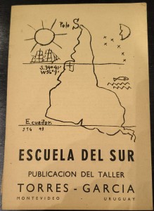
Joaquín Torres García: “América invertida” (1943), for “Escuela del Sur” of the Taller Torres-García.
In 1957 Guy Debord published his “Naked City”, a consequence of his “drifts” through the city of Paris. On the obverse of the map (because the map was foldable), one can read: “Discours sur les passions de l’amour. Pentes psychogeographiques de la dérive et localisation d’unites d’ambriance” (“Discourse on the passions of love. Psychogeographic slopes of drift and location of environmental units”). I don’t think that with these proclamations anyone can resist getting lost in the city of Paris, with or without hallucinogenic substances, to find their own corners in which to create and share with others environments that transform the experience of space. And whoever says Paris, can think of any other city in the old continent, in which there are spaces institutionalized by official culture that can be transformed by a contemporary experience.
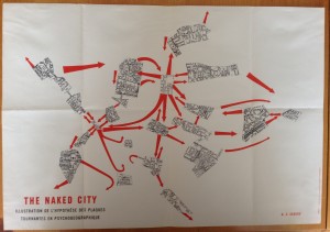
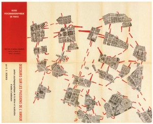
Guy Debord: “Naked City” (1957)
In 1970, John Cage introduced the map of Concord (Massachusetts) in one of the pages of his score “Solo for voice 3”, where the performers must musically read the territory through the lines that represent the roads, rivers, railroad tracks, towns and conventional signs of the map.
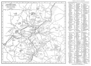
Map of Concord (Massachusetts), near the city of Boston, played a fundamental role in the defense of the city and in the beginning of the War of Independence, with George Washington at the front, used by John Cage as a score for “Solo for voice 3” (1970)
We must also refer to the work of Alighiero and Boetti: “Map” (1989). The work was made in collaboration with a group of Afghan women, who hand-embroidered a world map in which the oceans take on purple tones, the continental areas are marked with national boundaries and the flags of each country, and text in Farsi, Italian and English is included.
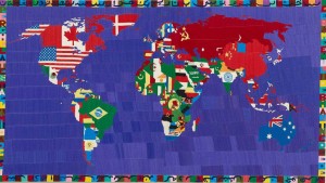
In recent decades there have been many attempts to make maps more intimate, more personal, as in the work of Guillermo Kuitca: Untitled (Le Sacre), 1992. Acrylic on a mattress with wooden and bronze legs, a work in which the map is literally introduced into our bed.
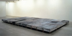
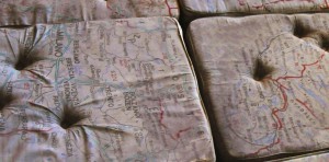
Guillermo Kuitca: Untitled (Le Sacre), 1992
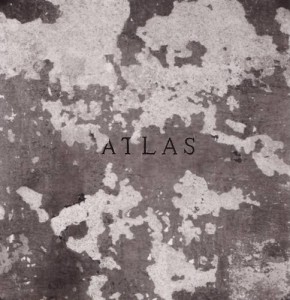
Untitled (Atlas), Chema Madoz, 1998
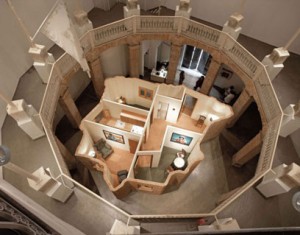
Heroic Acts, Casa España, 2005, Mateo Maté. At the Sala La Gallera in Valencia (now closed).
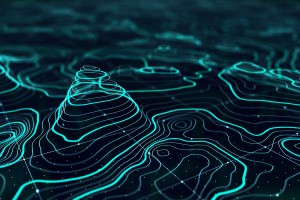
Contour lines with Autocad.
Returning to the beginning ―Geomatics―, as a definition, is a modern scientific term used to express the systematic integration of techniques and methodologies for acquiring, storing, processing, analyzing, presenting and distributing geographically referenced information. It represents a considerable qualitative leap with respect to what was previously mere cartography, and in the field of graphic representation it is inseparable from the emergence of computer science and cybernetics.
All this has coincided in the field of visual arts with the emergence of maps, often of concepts. In this context, diagrams have been used to map situations and conceptualizations. We could see it, for example, in the large map-diagram “Anatomy of an AI system”, a work by Kate Crawford and Vladan Joler, referring to the process of creation, assembly, start-up and waste disposal of the device popularly known as Alexa, which was shown here in Spain for the first time at the José Guerrero Art Center in Granada, in the context of the exhibition “All museums are science fiction novels”, in December 2021 (it had previously been shown at the Victoria & Albert Museum in London, in 2018); it can be seen on the internet, with the possibility of almost unlimited expansion, see here .
The authors, who are scientists, although operating in the field of visual arts, define it as: “Anatomical map of a case study “Amazon Echo” [what we popularly know by its given name “Alexa”] as an AI system made of human work”. And indeed, there is a great deal of human labor involved in Alexa, starting with the extraction of the mineral resources needed to manufacture the microchips that power the device, primarily lithium, smelting those minerals, manufacturing the components, assemblers, distributors, transporters; the IT part of the process is not far behind in the use of human labor, both in terms of software creation and the use of the Internet and all the infrastructure that makes it viable, a point where the Amazon Data Center occupies a central position; to end in a third phase concerning the treatment of obsolete devices and all the waste generated, some of it highly polluting, as stated in the “anatomical map”: “Hazardous substances found in electronic waste include significant amounts of lead, cadmium, chromium and flame-retardant plastics. Cathode ray tubes and components with high lead content are considered hazardous to health. Inhalation or handling of such substances and regular contact with them can damage the brain, nervous system, lungs, kidneys and reproductive system. Working in closed and poorly ventilated areas without masks or technical knowledge results in exposure to dangerous and slowly poisoning chemicals. Due to lack of awareness, workers are also putting their health and the environment at risk”.
In the “Anatomy of an AI system” (2018), by Kate Crawford and Vladan Joler, if you look closely you can see, in the center of the image (and enlarged below), a graphic that would represent, making it explicit, what is known as the “black box” of Artificial Intelligence, seeking to unravel the biases in language models, which are not verified or audited (keep in mind that these AI systems act in response to statements that they interpret based on a language corpus that has been previously selected and entered into the system’s own database).
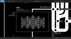
Kate Crawford and Vladan Joler: “Anatomy of an AI system” (2018), detail.
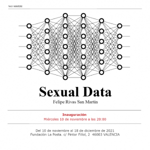
Simultaneously with the exhibition in Granada of the map-diagram “Anatomy of an AI system”, the same graphic that we have highlighted above could be seen in Valencia, on the occasion of Felipe Rivas San Martín’s exhibition at La Posta Foundation: “Sexual Data”. Felipe Rivas did not hesitate to use in this project, at the time of making the plastic representation of the procedures that are being used in the management of big data for uses that he denounces as discriminatory ―such as those that would supposedly serve to identify homosexual subjects by comparing millions of faces archived on the servers where big data is stored―, for this purpose he makes use of this kind of diagram that shows, in a plastic way, the idea of connecting hundreds of nodes of information without explaining the method used for this.
It is also influencing new forms of representation of mapping situations and conceptualizations, the type of diagrams that emerge from the Sketch Engine computer application. Normally used by translators and interpreters, it is nevertheless a powerful tool for unraveling the functioning of language, which is in turn a powerful tool for shaping reality, also in the field of visual arts.
The very name of the application (Sketch Engine) is very expressive of its possibilities. In addition to its primary use, which is to unravel the meaning of words (verbs, nouns, adjectives, etc.) in other languages, by identifying the way they are used in those other languages (clearly influenced by the thought of Ludwig Wittgenstein; or, here in Spain, it would be the idea expressed by María Moliner in her Dictionary of the Use of Spanish); Furthermore, it is capable of taking into account the relationships and the intensity of these relationships between the words/ideas that support the thought expressed with the real and effective use that we make of the language, which is determined by the application, taking as a reference the use of the language according to a corpus of texts that we have previously introduced into the application, so that it can carry out its work of unravelling the meaning of the words according to the use that is given to them, as well as preparing the sketches or diagrams (which seem as if they describe gravitational orbits).
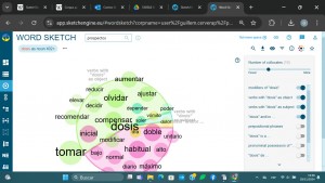
In the example above, texts from medical leaflets have been introduced into the Sketch Engine application, because we are working on the language of pharmacology, and, in relation to the word “dose”, the diagram or sketch shows other words that are related to the selected word, both when it is used in the sense of action (taking a dose), and when it is used in the sense of quantity (a good dose), configuring a kind of gravitational fields that appear in the sketch in green or pink, respectively, and, depending on the intensity of the relationship and the greater or lesser number of times that these words are related to the main word chosen ―the one that constitutes the object of the study― these other words appear in the sketch closer or further away from the word “dose”, as well as in a larger or smaller size, all in relation to the word that is being worked on. The influence of this form of representation of conceptual maps can be seen, in the case of recent artistic work, for example, in the work of the painter Curro González: “Cartography of the grotesque factor”, 2012, in which he proposes to make a representation of the set of relationships between artistic works that have addressed the grotesque.
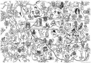
Curro González: “Cartography of the grotesque factor”, 2012.
As Ricardo González-García comments, in “(Dis)orientation in the plasticity of a map without distances: Rhizome, palimpsest, drifts and the (im)possible cartography of contemporary art”, in the journal AusArt, 10 (2), UPV/EHU, 2022, pp 67-81, he understands that the cited work of Curro González is a categorical study of the grotesque, “a very personal and rhizomatic inquiry that has the objective of establishing relationships between a whole cast of artists from different periods. Correspondences between artists that, if viewed from another perspective, might have nothing to do with each other.”
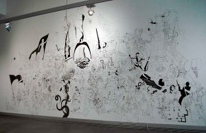
In the same vein is the work of Mariusz Tarkawian: “History of Cartagena test” (2010), a large-scale mural drawing made at the ARQUA Museum [National Museum of Underwater Archaeology], Cartagena, within the framework of Manifesta 8, Region of Murcia, 2010. The work narrates a good number of events, characters and circumstances of the history of Cartagena, without maintaining the typical linear historical structure, but rather using a method of accumulation, in which the spectator can establish associations by proximity or by other types of formal or conceptual relationships, often unpredictable.
In conclusion, it can be said that the mapping of situations and concepts has a long tradition in modern and contemporary art, which has been acquiring expressive and representational resources often taken from cartography and geomatics, and, in general, from applied cybernetics with variable purposes, a process that we cannot say whether it has introduced clarity into communication, because the struggle is between clarity and construction of meaning, which tends to be increasingly complex.

